
eLearning Site Redesign
Background
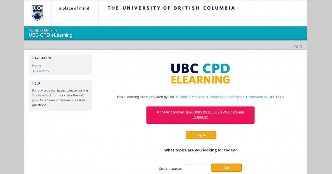
Our eLearning site was first launched back in 2014, using the learning management system (LMS) Moodle. Since then our site as grown, and at the time of writing, we have 59 open courses!
We found that our eLearning site was starting to experience some growing pains, and our site was no longer able to provide a great user experience to our learners.
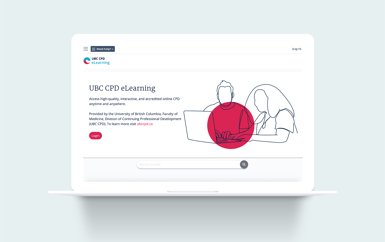
In 2020, UBC CPD underwent a branding refresh. Our Creative Team was tasked with redesigning our eLearning site, updating the look and feel to match the division’s new creative direction, and improving the user experience.
Challenge
Due to the nature of our LMS, we had to design within many restrictions. A large portion of the LMS is hardcoded from the back-end, so we would have to come up with design solutions that worked within the existing framework.
Process
To identify the areas of the site that needed improvement, we first looked through feedback from our learners on our existing design. This feedback was collected through post-course questionnaires, our site feedback form, and our support inbox. From this feedback, we made note of the most common complaints.
Displaying courses, and course categories
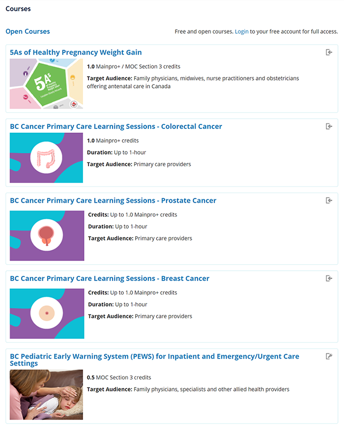
We knew we had to improve the way our courses were displayed on the site. All of our courses and conference materials were displayed on the front page. This worked back in 2014 when we had a limited number of courses, but we have long outgrown those times. This resulted in our front page becoming too long, overwhelming, and difficult to browse.
Furthermore, the course categories on our site confused our learners, as the category names were more reflective of the course settings on our end, and did not give any useful information about the actual content that was within each category.
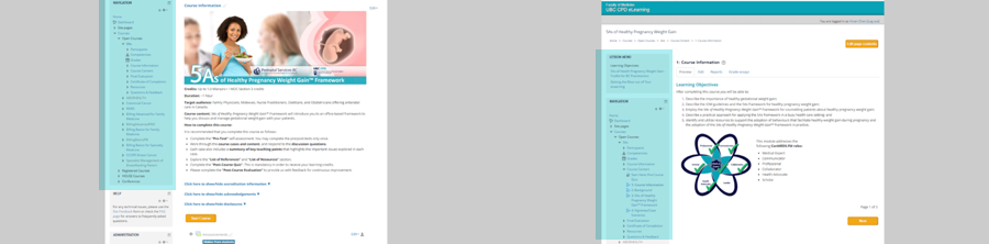
Navigation difficulties within courses
Our site's UI elements were cluttered, and the course pages displayed many links that were not relevant to the learner's needs. This resulted in our learners having difficulties finding the pages that they were looking for.
Quote from a learner:
“It’s a bit hard to navigate when going back to previous slides. I wanted to look up an abbreviation and it was too bothersome to actually find the slide with the abbreviations.”
Linking back to the main website
Another big issue with the eLearning subsite was that there was no clear way to navigate back to our main UBC CPD site. Ideally, we would like our learners to view our full list of learning resources on our main site, instead of viewing only the eLearning content on our subsite, as the learners are not viewing the full range of our content/services available.
With these design goals in mind, we mocked up an interactive prototype and conducted user testing sessions. Next, we used our feedback from the user testing sessions to inform our design solution.
Solution
For the courses displayed on the front-page, we switched to a card format as opposed to a list format for a smoother browsing experience. We limited the number of courses displayed on the front page and added a button for users to click on, to view all the courses, which could then be separated into our new course categories: online courses, blended learning, instructor portals, and conference materials.

The redesigned site features a clean user interface with a focus on white space, to allow for the learning material to be the main focus on the page.
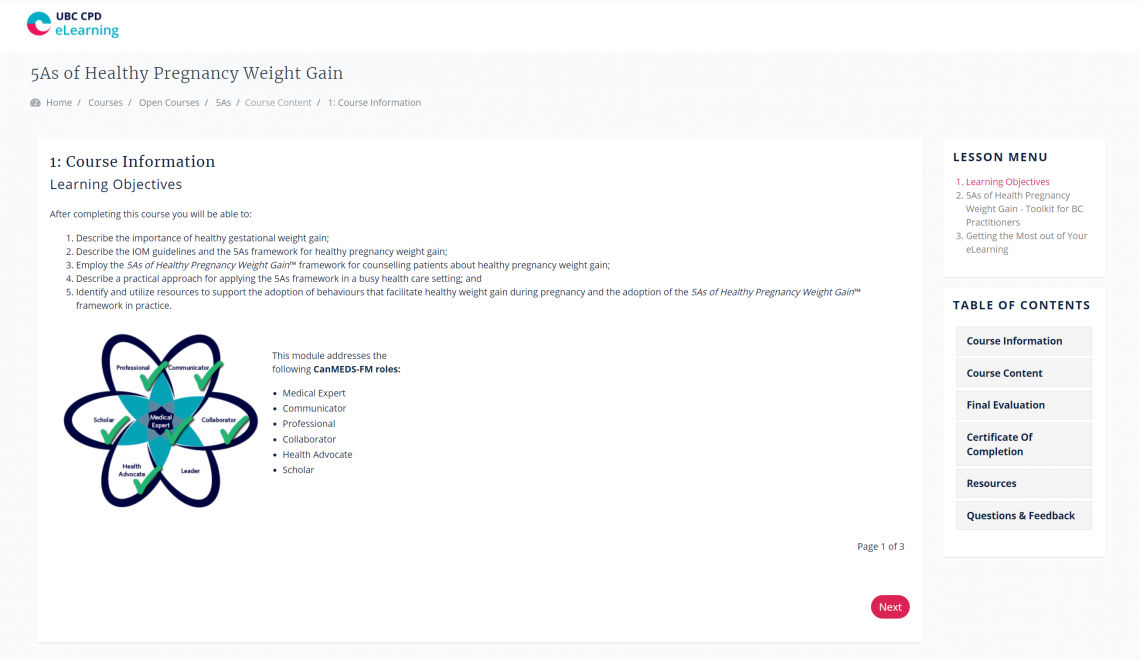
In-course navigation was simplified so that learners only see the links pertaining to their lesson on the right panel of the page, without the old visual clutter. In addition to the redesigned navigation panel, we have also implemented a user tour system, to walk learners through key user interface elements.

To link our eLearning site back to the main site, we will be implementing a universal navigation bar at the top of the eLearning site. This will allow learners to easily return to the main site at any time, and also tie the two websites together.
Testimonials
This website is awesome! The platforms are accessible and easy to use :)
Thanks for all that you do to create and maintain such a professional platform for continuing medical education and professional development.
Next steps
Going forward, we will continue to monitor user feedback, and think about ways to improve our learner's experiences, even challenging our existing design systems if needed.